Two-tone kitchens
Two cabinet colours instead of one — which two to choose, where to put the split, and the pairings that keep a two-tone kitchen looking deliberate rather than like a mistake.
Get a free quoteA two-tone kitchen uses two cabinet colours instead of one — and when it's done well, it adds depth, draws the eye, and lets you be braver with colour without committing the entire room to it. Done without a plan, it just looks like you couldn't decide. The difference comes down to three things: which two colours, where the split goes, and keeping one of the two quiet.
Where to put the split
The split should follow the shape of the kitchen, not land somewhere arbitrary. Three placements work again and again:
- Darker lowers, lighter uppers. The classic. A deeper colour on the base cabinets grounds the room; a lighter colour above keeps it feeling open and airy.
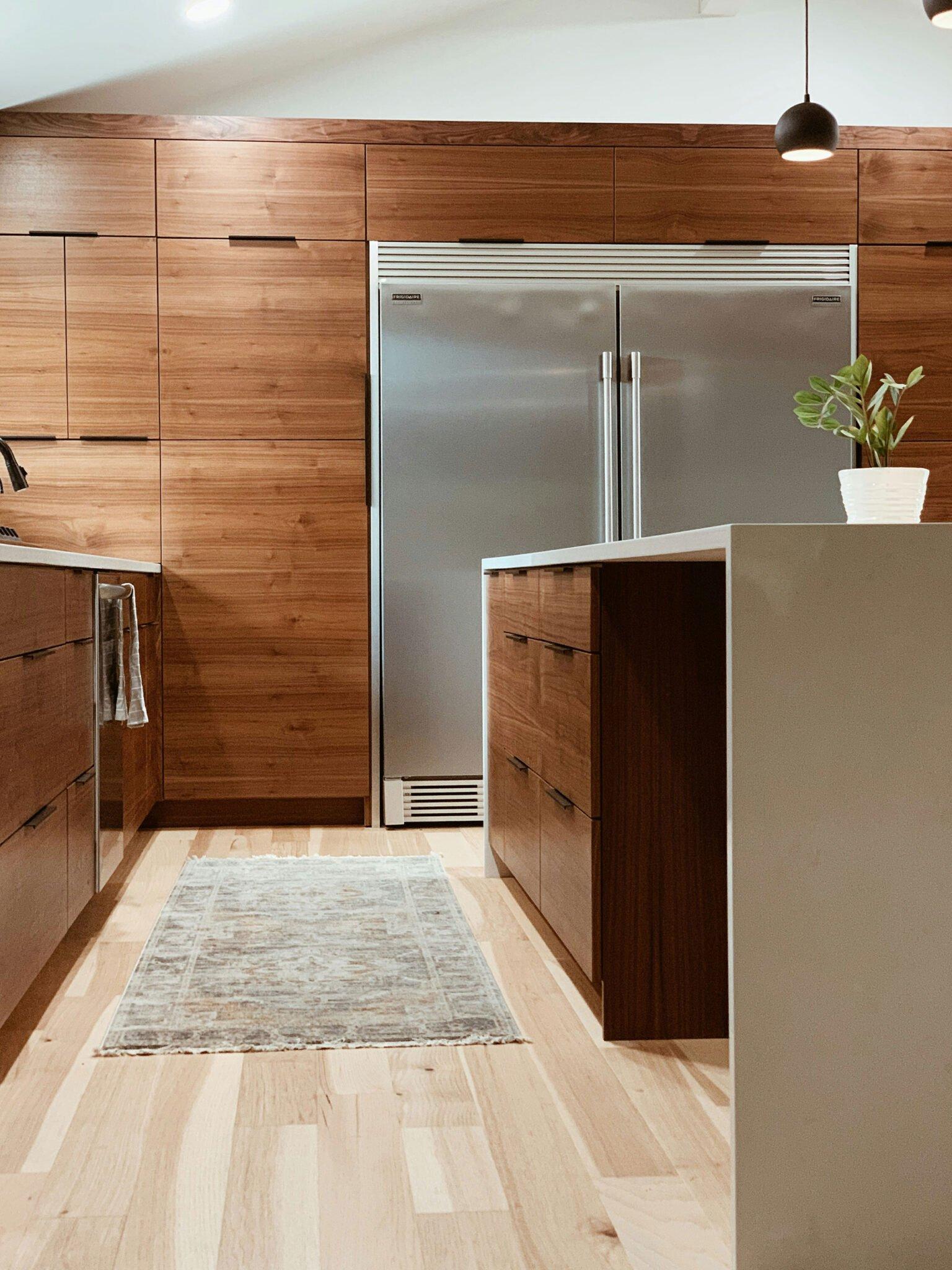
- Contrasting island. Lighter cabinetry around the perimeter with the island in a richer colour or timber — the island becomes the hero of the room.
- Feature run. The tall bank or pantry wall in the second colour, with everything else neutral — a block of colour that anchors one end.
The rule that keeps it from looking like a mistake
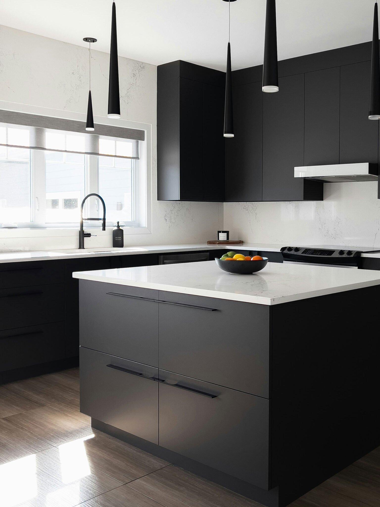
One colour leads, the other supports — never two loud colours fighting for attention. The formula that almost always works is a quiet neutral (white, off-white, warm grey or greige) paired with a single richer tone: deep green, navy, charcoal, or a warm timber. The neutral does most of the room; the second colour is the accent. Get that hierarchy right and the scheme reads as considered; get it wrong and the room feels busy.
Pairings that work in NZ homes
- Warm white + timber island: light, natural and endlessly liveable — our most-asked-for two-tone.
- Off-white + deep green: soft and characterful, a green that nods to the landscape outside.
- Greige + charcoal: a quiet, modern contrast that stays calm and ages well.
- White + navy: crisp and confident, with the navy usually on the island or lowers.
Tie it together with benchtop and hardware
A two-tone scheme locks in when something carries across both colours. Run the same benchtop over both tones, pick a splashback that bridges them, and keep the handles consistent throughout — one hardware finish across both colours reads as intentional. These small continuities are what make two colours feel like one design. Our kitchen colour ideas guide goes deeper on coordinating the benchtop and splashback.
Two-tone in a small kitchen
Two-tone works in a compact kitchen if you use the darker colour sparingly — on the island, a single run, or the lowers only — and keep the rest light so the room stays open. Too much of the second colour closes a small space in; one well-placed accent gives you all the effect with none of the weight. If space is tight, our small kitchen ideas are worth a look alongside this.
Get the pairing right the first time
Two-tone is one of those choices that looks effortless when it's right and awkward when it's nearly right — so it pays to test it. We'll put real samples of both colours against each other and your benchtop, show the split in 3D, and build it to the millimetre in our Rotorua factory, with a fixed written quote before any work starts.
Frequently asked questions
What is a two-tone kitchen?
Where should the colour split go in a two-tone kitchen?
How do you choose two colours that work together?
Does two-tone date faster than a single colour?
Can a small kitchen be two-tone?
Explore more
Design a two-tone kitchen that looks deliberate
We'll test both colours against your benchtop, place the split to suit the room, and build it to the millimetre in our Rotorua factory — with a fixed written quote first.